1 / 16
MMA 235 — Visual Communication Design
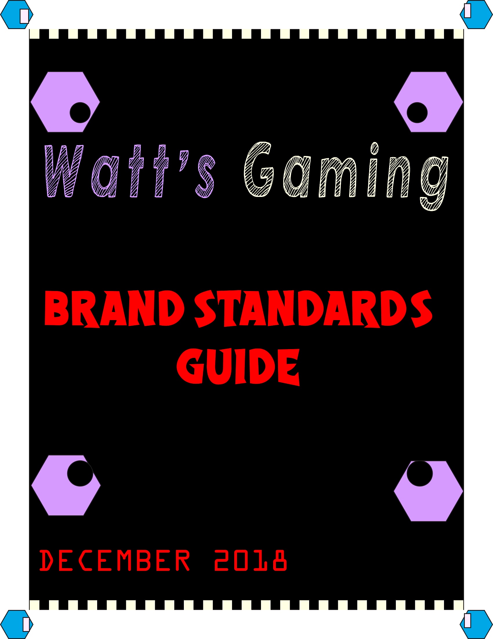
Brand Standards Guide
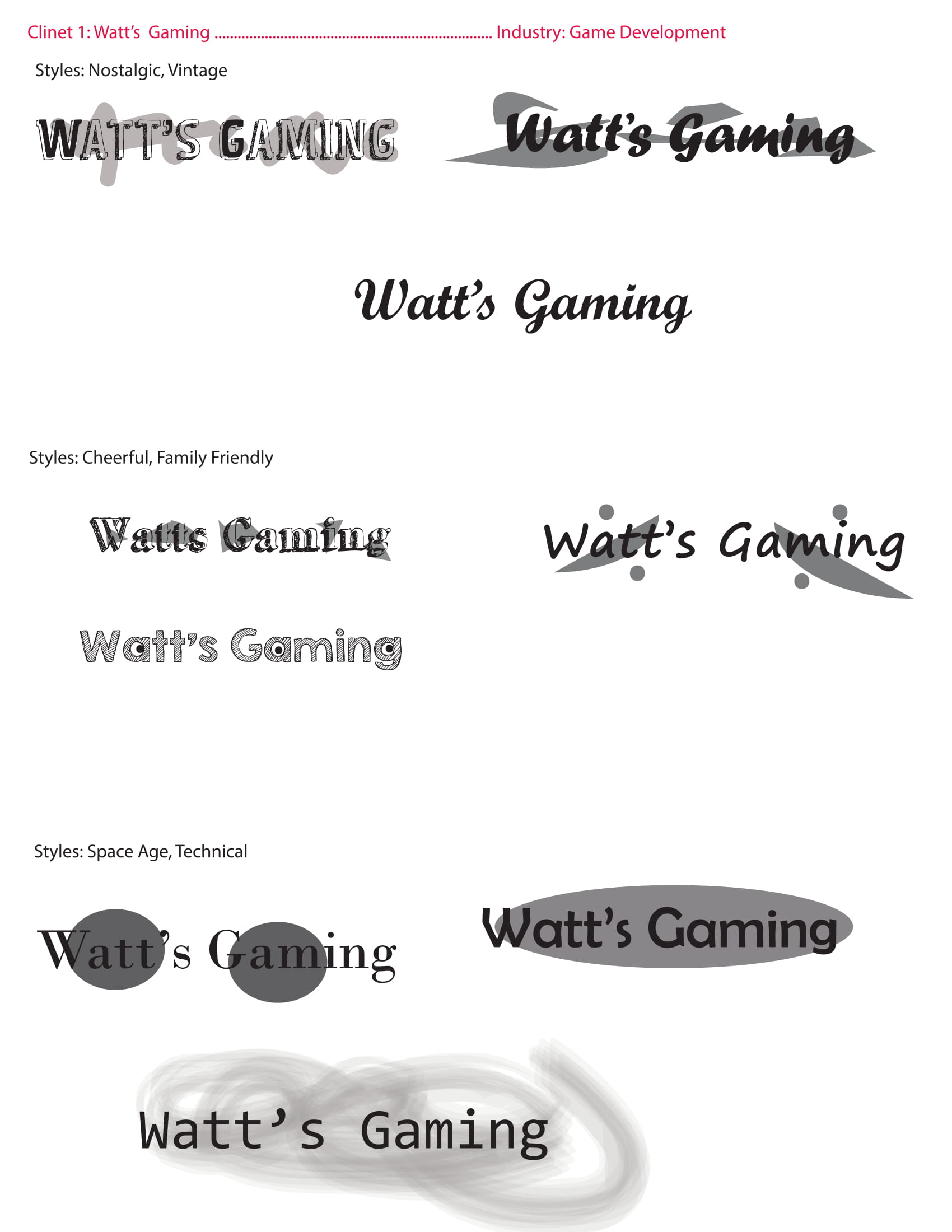
For this project, I had to pick a classmate's last name and build a fictional company around it. I chose two — Watts and Graham — and this is the full branding journey for Watt's Gaming.
The Journey
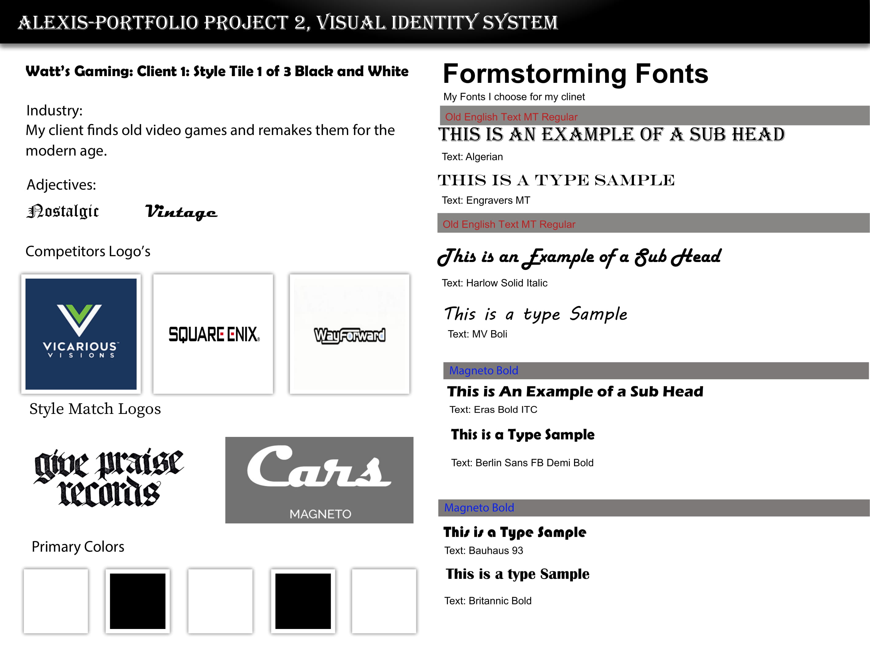
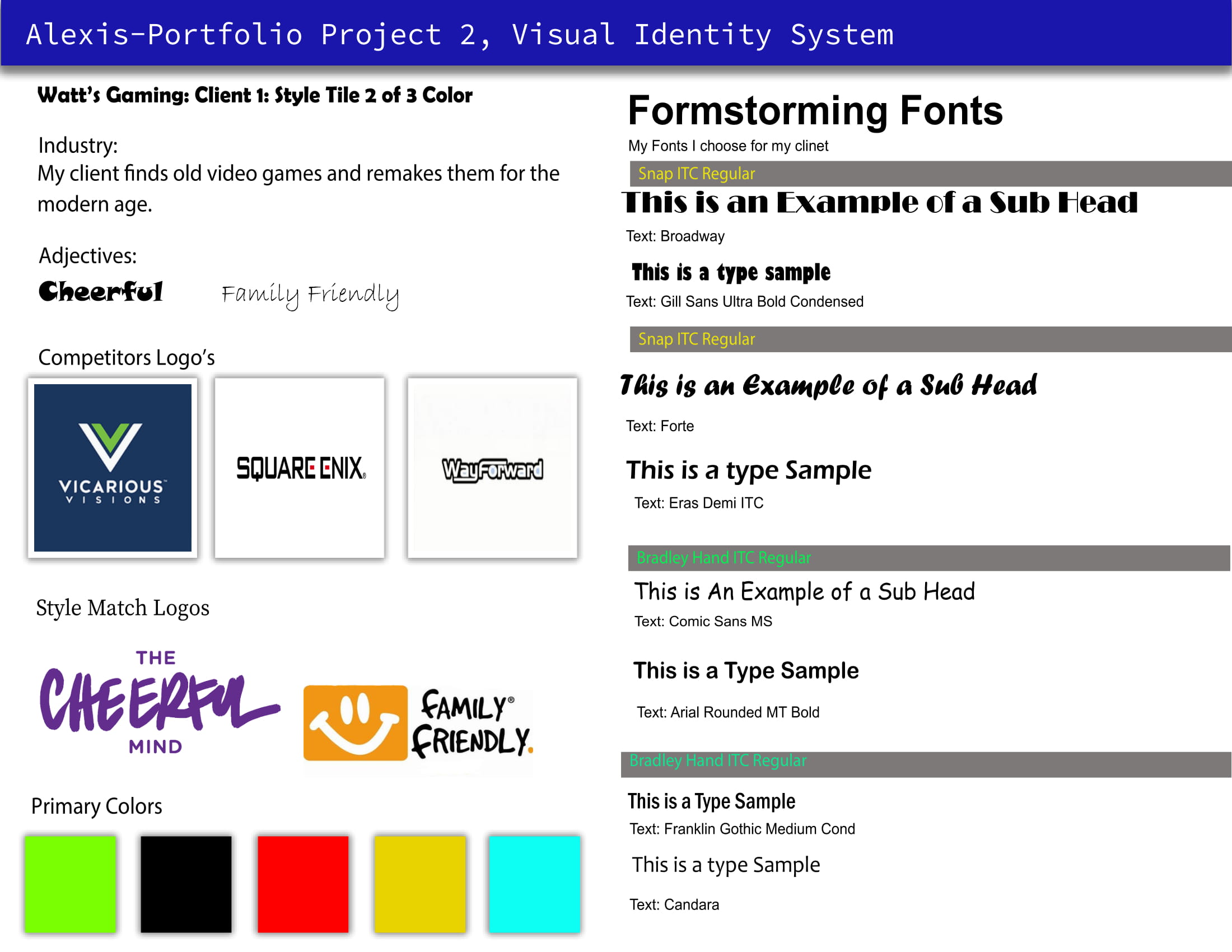
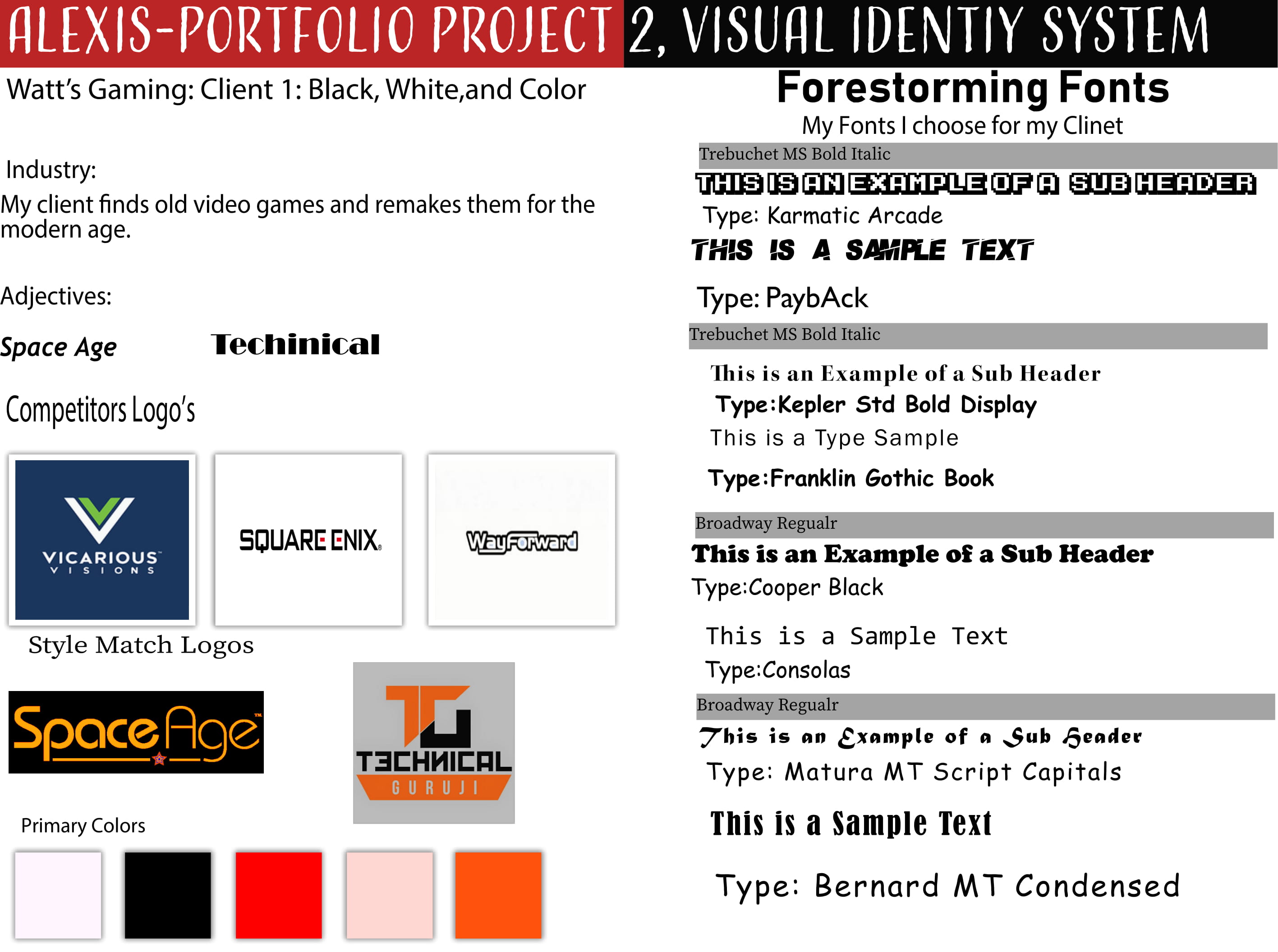
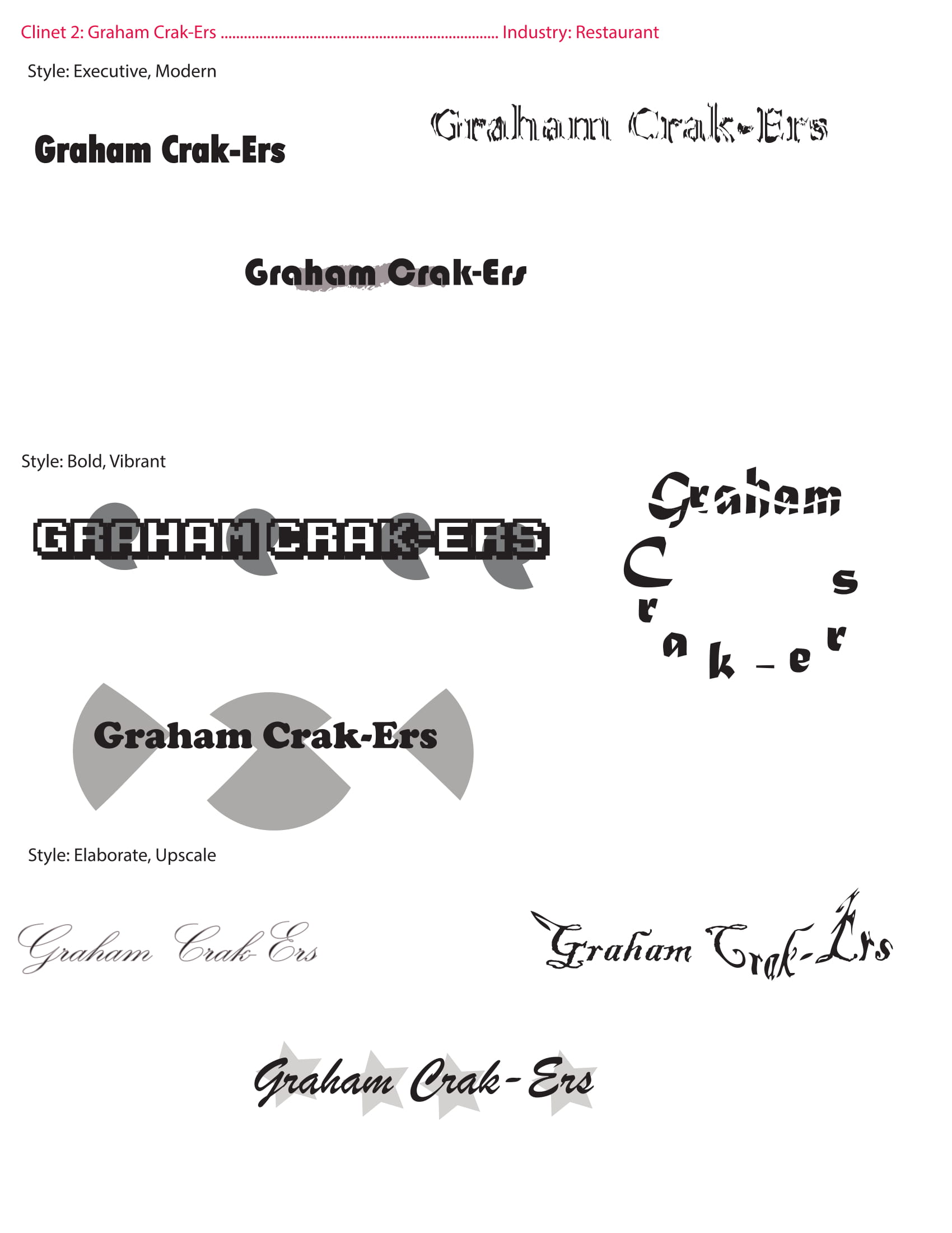
Created three visual direction boards exploring the look, feel, and personality for Watt's Gaming — from color palettes to typography choices and texture inspiration. I also made style tiles for Graham Crk-Ers (a healthy restaurant brand based on my classmate Graham's name), which you can see on the main gallery.
Developed logo concepts and typeface explorations, iterating through dozens of ideas to find the right visual identity that says "retro gaming meets modern design."
Compiled everything into a professional 16-page document covering logo usage, color specifications, typography rules, and brand application guidelines.
Step 01
Three visual direction boards exploring the look, feel, and personality for Watt's Gaming.
Step 02
Logo concepts and typeface explorations — finding the right visual identity for Watt's Gaming.
Brand Identity